4 Keys to Designing a Great Mobile App

So, you’ve made your first Thunkable app! It works exactly how you want, but something’s missing. It doesn’t look as nice as you had imagined. I won’t drone on about the differences about UX and UI design in this blog (don’t worry, we’ll get to that soon enough); instead, let’s go over some basic visual design principles to help your apps come to life.
Why Doesn’t My Mobile App Look Good?
Many articles talk about visual design being subjective, however, there are some common principles that can be the building blocks of any effective visual design. These include:
- Hierarchy
- Consistency and cleanliness
- White space
- Brand tone
One of our very own Creative Success team members created this app the other week for one of our Weekly Design Challenges…

Let me go through the principles I’ve outlined above to help improve the visual design of this app.
Establish a Hierarchy
Visual hierarchy tells the user in what order they should look at the elements on a page. This can be accomplished by how components are laid out on a screen, visual weight, relative size, and contrasting colors. A successful layout balances these properties and can visually showcase to a user what to look at first.
Location
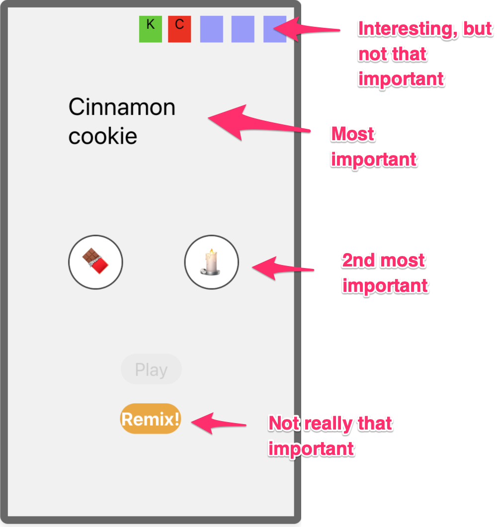
In most western countries, we read from left to right and top to bottom. This trick can help you organize your items in a layout by placing the most important items near the top left and the least important or last items on the bottom. When designing the UX of an app, you can also keep this trick in mind when adding buttons to go forward and backward. Right and bottom will often mean “next”, so try to utilize different areas of your screen to help users know where to go.

Weight
Instead of making components bigger to indicate importance, think of changing their weight instead. Weight can be created by making a font bolder or darker. The opposite is also true, lessen the visual weight of a subtitle by lightening the font color, or even use a thinner font. Not all fonts need to be black; use tones to create visual weight.

Size
The larger the better, right? Not always. While a large item can indicate a more important object, it can also take over the items on a page when clashing with other parts of your visual design.

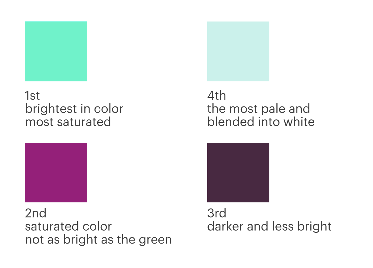
Color
The brightness and saturation of a particular color can draw a lot of attention to an object on your page. Colors can also represent a lot of meaning. Red will often indicate danger, yellow indicates a warning, and green means success. With this in mind, try to design your page without color first to see if your hierarchy works. Then, add in color later to enhance its visual appeal.
Let's return to the example of the KitKat or Candle app. Because all of the items are the same size, but have a slightly different weight, the present hierarchy shows the score being the most important, followed by the remix button, then the question, then the kitkat and candle buttons. In redesigning it, the first exercise is to determine the relative order that I want my users to look at each object.
Consistency and Cleanliness
Where a lack of hierarchy can make an app feel confusing, the lack of consistency and cleanliness in an app will make it look messy. The top three things that contribute to a messy-looking app include poor alignment, too many styles, and low-resolution images.
- Poor Alignment: Have you ever looked at photos of items laid together in a grid? They feel super satisfying, don’t they? This is because the human eye craves order and pattern. When we see objects aligned, they feel whole; however, the minute we see things out of order, it calls out to us, drawing attention to the chaos. We use alignment in design to create structure on a page.

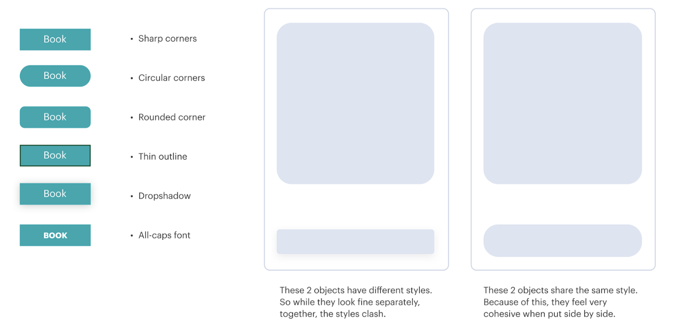
- Too Many Styles: Think about style like creating a matching outfit. When there are too many clashing patterns and colors, an outfit can look messy. That’s not to say contrasting patterns can’t be pulled off. Yes, Harry Styles can do it well, but maybe you shouldn’t try that approach for your app… For the rest of us, it’s easier to pick a theme and stick to it. What this means in the world of interface design is to think about component attributes and how we might stick to them. In the image below, I’ve laid out a few ways that the button styles can be used. When you’ve picked a style, try to make all your buttons feel the same.
- Low-Resolution Images: I don’t know about you, but blurry photos make my eyes hurt. They make me feel like I need glasses (aside from the ones I’m already wearing). So, how do we prevent this when making an app?
- Generally, our eyes can perceive 300ppi (that’s pixels per inch) on a screen as looking nearly “real to life”. Anything less than that looks blurry, and anything more is pretty indistinguishable. In the days where monitors were less sharp, we could get away with low-resolution images; this is because nearly everything on the web at 72ppi didn’t look very sharp. However, as screens and monitors start to improve, so, too, do our images. The Apple retina display can display 226ppi and the new Super Retina display can display 458ppi!
- So, what does that mean for exporting images? Basically, because a retina screen can display twice as many pixels per inch, our images need to be twice as big to show up sharper. In programs like Figma or Sketch, you can export at 2x or at 3x. In other programs like Photoshop, you can set the export ppi/dpi to 200 or 300. This means that if your image is 250x500 pixels, the exported image size will be at least 500x1000 or even 750x1500 pixels.

Utilize White Space
Now that we’ve learned some rules about how to put components on a page and line them up, let’s talk about space. My old graphic design teacher liked to talk about how visual design is like creating a physical space. Imagine a little person walking around the room of your design. Can they move around comfortably? Do they get stuck in the corners or between objects? Is there too much space between two objects, making the room feel empty? All these feelings we get in physical spaces translate very well to digital ones as well.

I personally like the standard of using the 8-pt grid system. A quick search on Google will yield tons of articles on how to set it up (like this one a few), but put simply, it's a system where all the spaces between are a multiple of 8. Small items are 8px apart, medium items can be 16px or 32px, larger gutters and margins can be 64px, etc. I love this system because, as mentioned above, consistency is the key to a clean UI.
Designing in Greys
With all the principles in mind, we can rearrange the items in the original app design as a wireframe using greys.

At this point, we’re not thinking about what the final images and style are; we’re merely thinking about hierarchy, layout, and relative sizing. Designing in greys is a great first step to make sure your app feels right before finalizing the colors, fonts, and images of the final app design.
Establish Brand Tone
Finally, let’s talk about branding. There’s a whole other article that can be written about branding, but let’s cover the basics. In the Consistency and Cleanliness section above, I showed some examples of how styling a button can create different looks. So, the question is, "How do we go about deciding which look to go for?"
In order to keep it simple, let’s not dive too deep into the nuances of developing a brand and instead keep the focus on making the app consistent and clean. My best rule of thumb to do this is:
- Define a small set of greys to use (4–5, ranging from light grey to dark grey)
- Define one primary color (try to limit yourself to just one primary color)
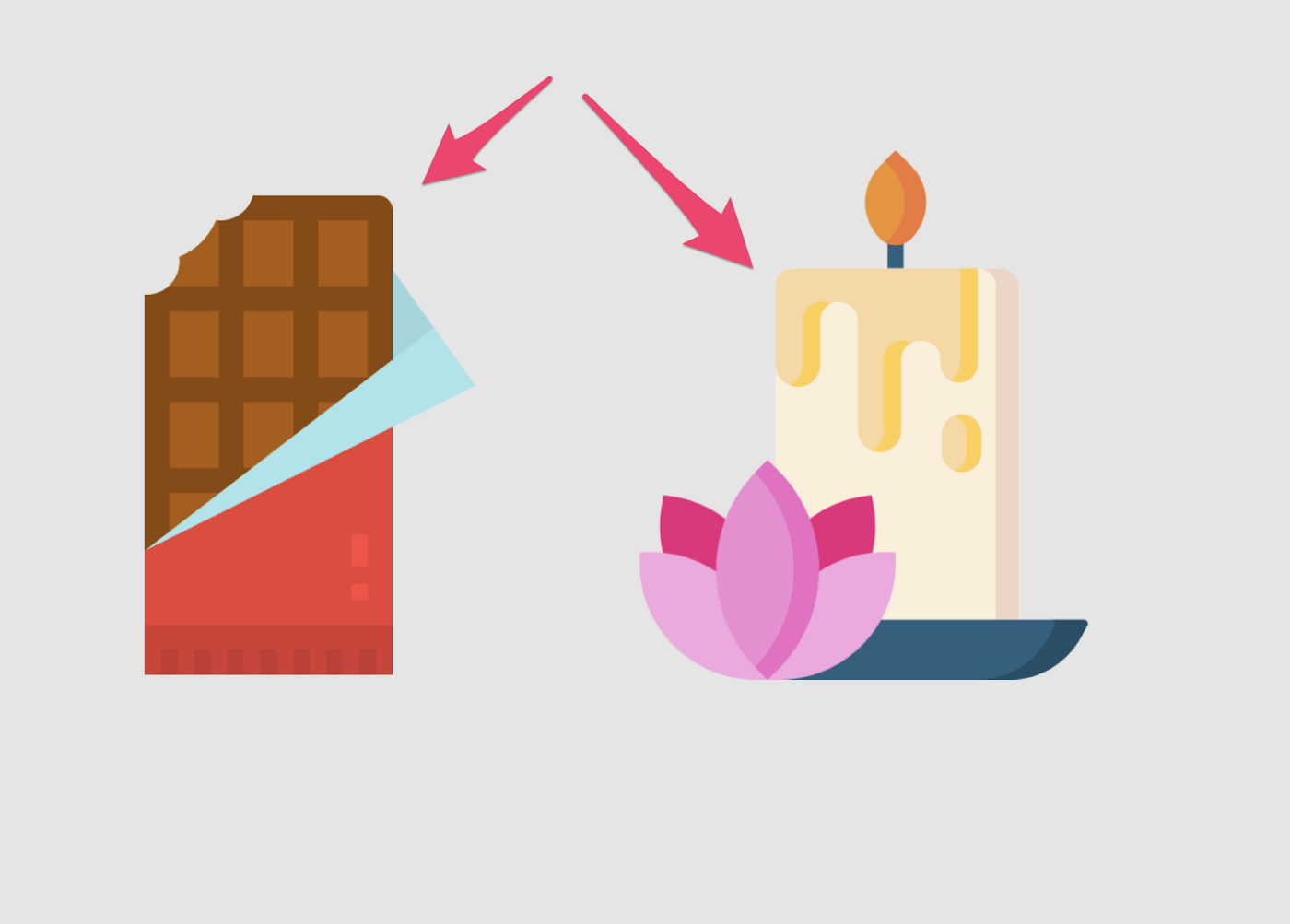
To help me define this set of colors with my KitKat and candle app, I’m going to first find the images for my buttons and base the rest of the styles around that. (I found these images on flaticon.)

With these images as my base, below are the colors I picked as my grey palette; I chose a blue as my primary color. Notice that greys don’t have to be pure grey (meaning the same percentage as in all three primary colors). Instead, think of your greys as having some tonality. To choose these greys, I took the warmness of the yellow candle and inserted that warmth into my two middle grey colors. In my lightest and darkest greys, they have a slight blue tinge so that I might have some contrasting hues. The dark blue that I picked is the same as the base of the candle image.

After choosing some colors, let’s choose some styles. The images are very flat, so I won’t add any extra shadows or gradients to my button styles. I also noticed these small rounded corners in both images and wanted to replicate that in my button styles.
And here’s the end result:

Not too shabby! We’re not winning any awards, but it’s clean, clear, and much more usable than how we started! (If you want to check out the final app, head here.
I hope you've learned a little today. Until next time, happy thunking!
Final Thoughts
To get started designing your perfect no code mobile app, check out Thunkable, the best no code app builder that makes it easy and fun to build native mobile apps.

Related Resources
.png)
.jpeg)
Three Ways to Avoid Rejection from App Stores
.png)

Ensuring Proper Quality Assurance Testing Before Publishing Your Mobile App
.png)
What's New with Thunkable? March 2024 Product Updates
What Will You Create?
Ready to take your first steps towards developing that amazing idea? Get started on your app for free.
